Writing · 25 May 2020
Different ways to visualise health
Looking at games and fitness apps
This month I did some research into how health is visualised in fitness apps and games. For a new app involving personal health I am looking for an intuitive way to visualise how healthy one person is. There are many colourful approaches out there!
How healthy your are
The app I am working on is still very much under development, but it provides a way to calculate how much risk you have on a cardio vascular event, like a heart attack or illness. For this app I am looking for a modern, fresh way to visualise this risk / health ratio.
Research
I looked at various health and fitness apps to see how they visualise health. In addition to these "serious" apps I thought it would be fun to look at games, too. Game designers sometimes have find creative ways to visualise health. It can be a good source of inspiration for the app I'm working on.
Apple Health, Activty and Apple Watch
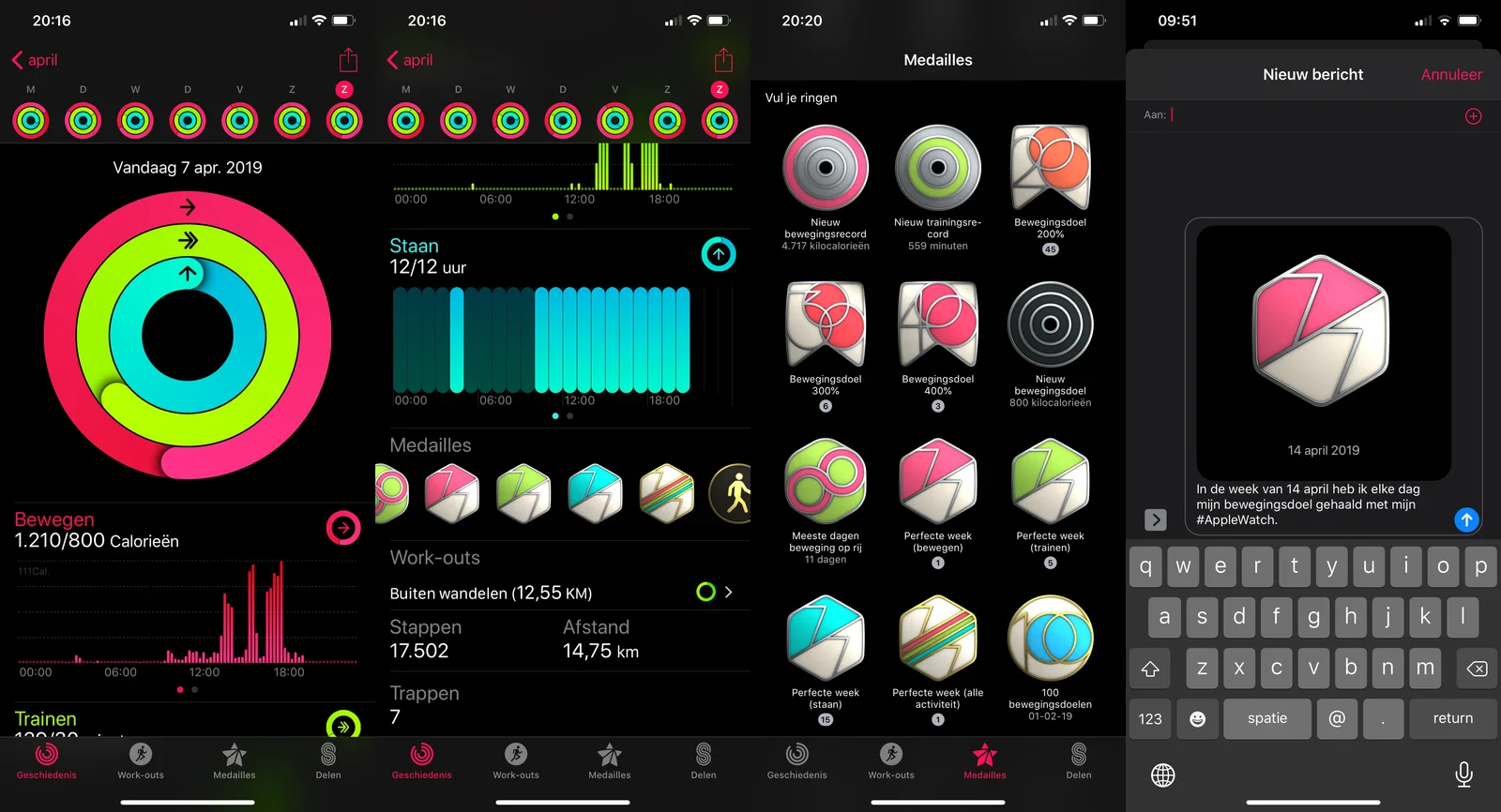
As companion app to the Apple Watch, the Activity app is the central hub for everything the Apple Watch measures with regard to personal health and fitness tracking.
Things to take away:
- bright neon colours
- main graphics are circles ("rings")
- different colours indicate different metrics
- there are colourful medals to be earned
- these medals can be shared with others (look how healthy I am)
Biostrap
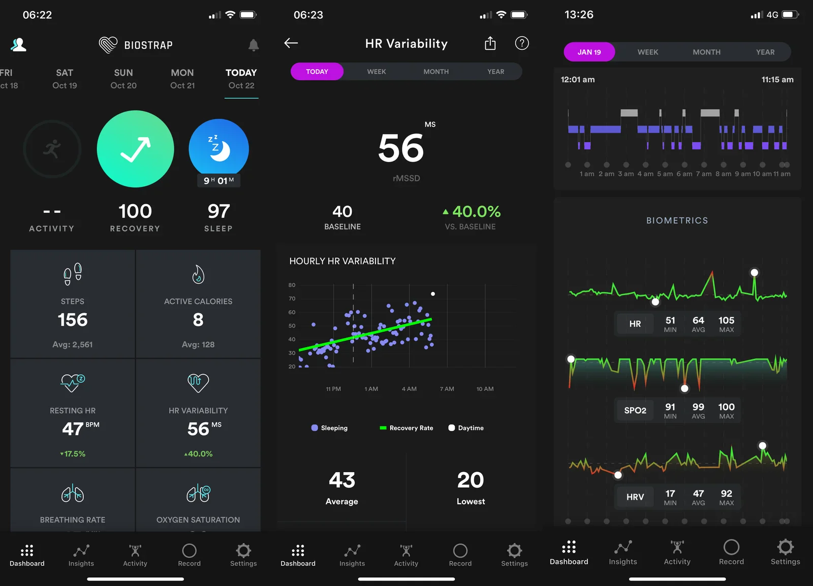
The Biostrap app is the way to access data collected by the Biostrap sensor.
Things to take away:
- bright neon colours
- colourful graphs and circle icons
- green indicates 'good', red indicates 'bad'
Pillow
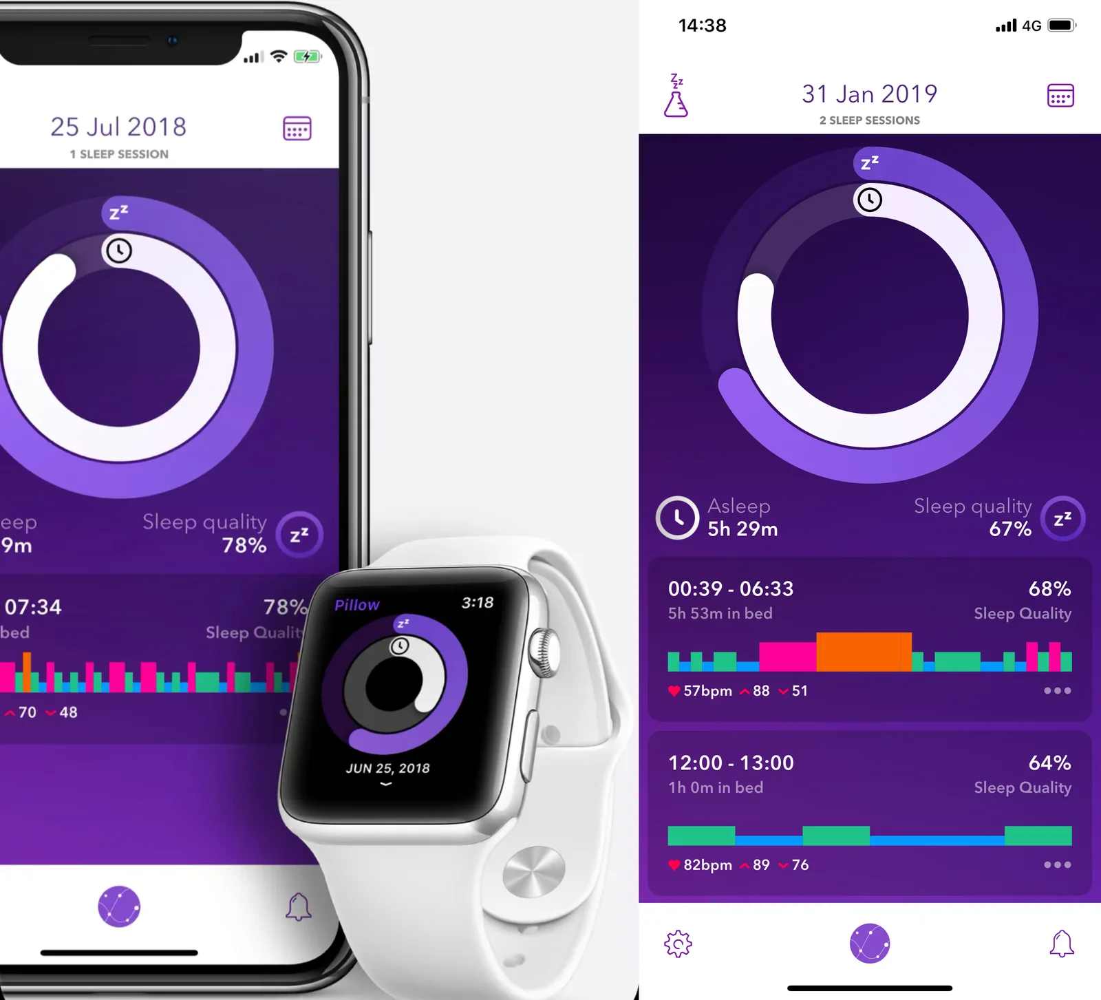
Using the Pillow app users can analyse their sleep. The app works with Apple Watch to collect sleep data such as heart rate and body movement.
Things to take away:
- bright purple colour as main theme
- bright colours in graphs
- main graphics are circles
- circles work well on the small (squarish) Apple Watch display
Whoop
The Whoop app allows access to data collected by the Whoop sensor. The app consolidates large quantities of data into two main metrics "strain" and "recovery".
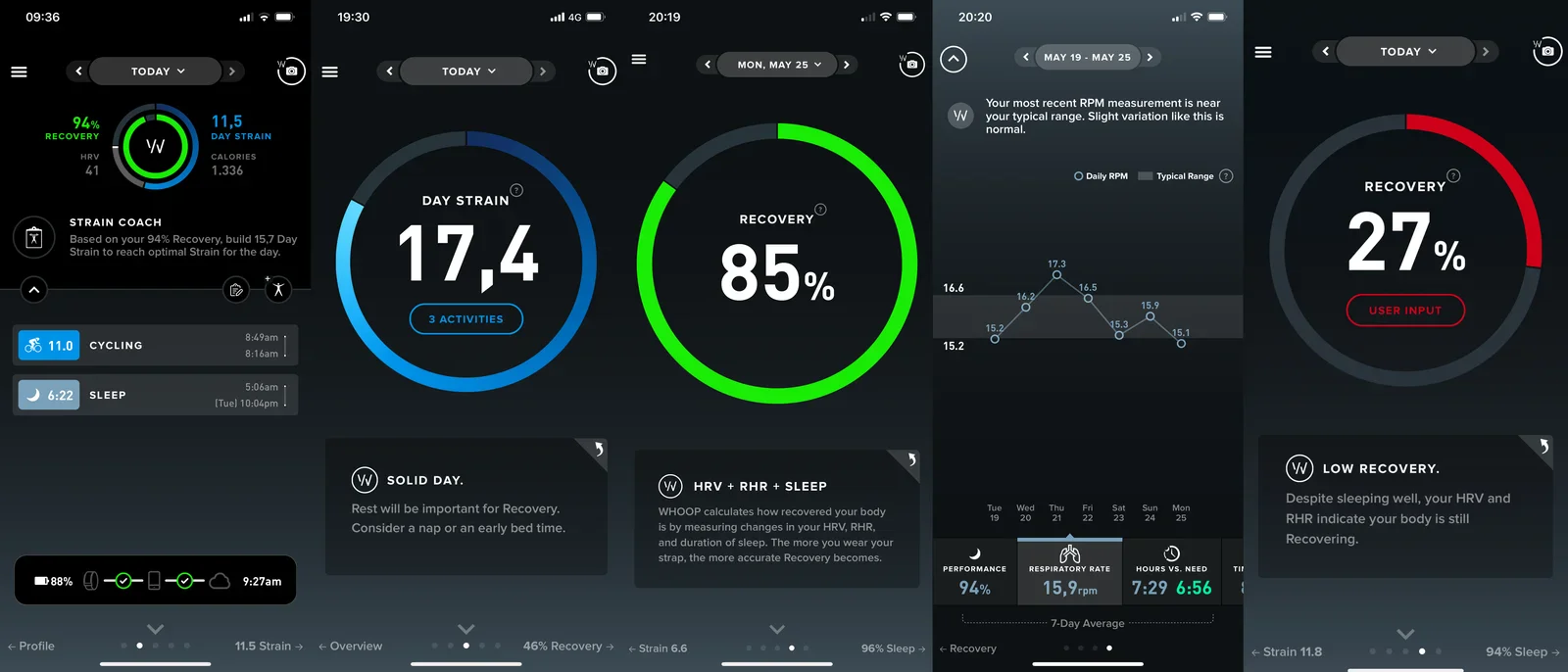
Things to take away:
- bright colours
- different colours have different meanings
- green indicates 'good', red indicates 'bad'
- main graphics are circles with percentages in them
- graphics are supported by "the voice of Whoop" text boxes
Mario
Nintendo's Mario is possibly the worlds most famous game character. The Japanese game company is known for their creativity and friendliness in their game design.
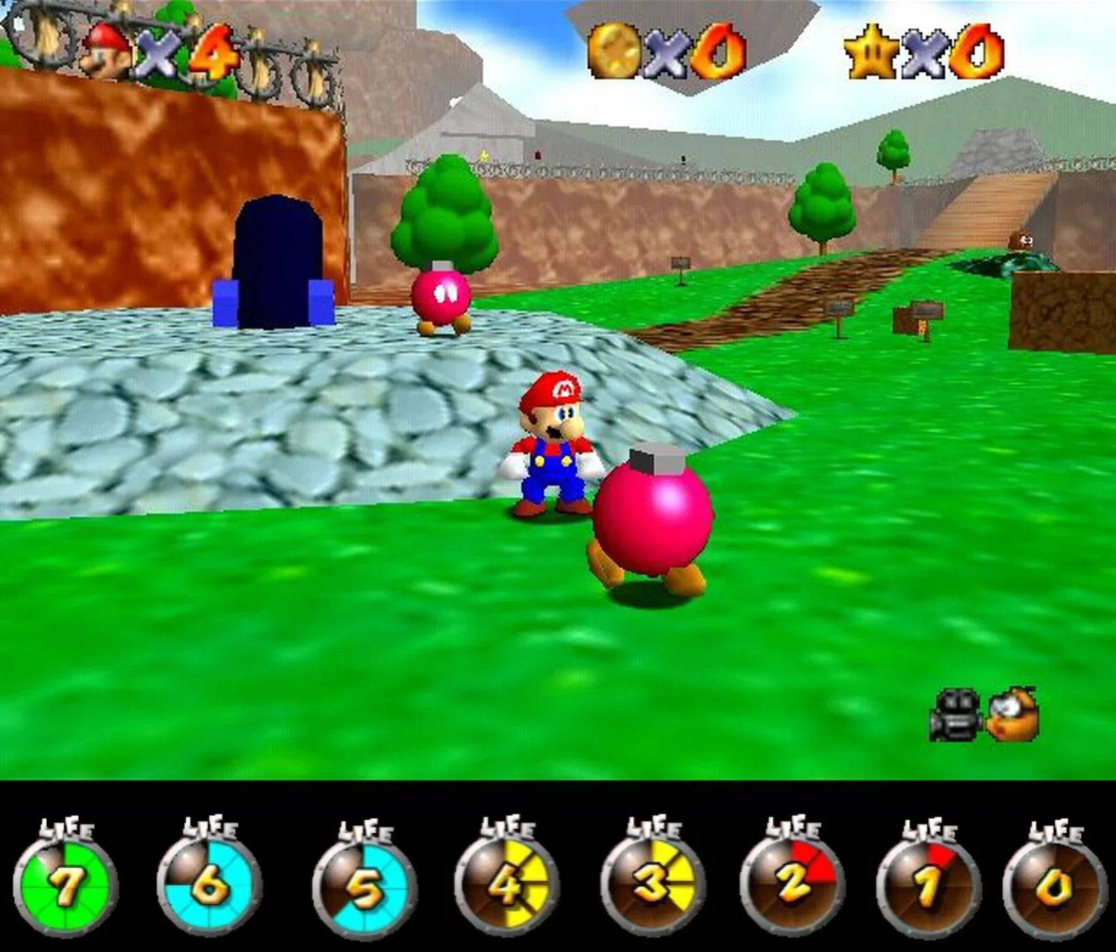
Things to take away:
- bright colours
- life counter "4x Mario" (upper left)
- life meter in a circles (bottom)
- different colours for different "life"-values
- numbers inside the circulair graphics
Doom
Possibly one of the most legendary first person shooters is Doom from 1993. This video game by ID Software greatly influenced many other games, it's an absolute classic.
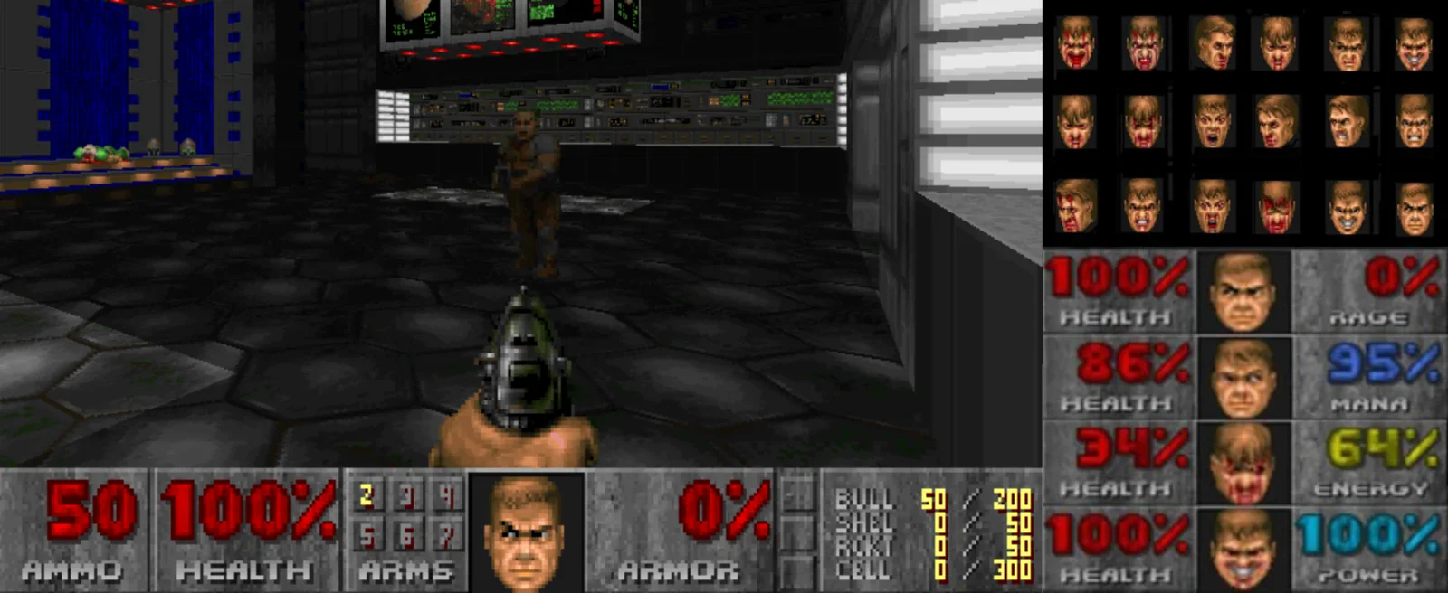
Things to take away:
- health is expressed as percentage
- Mud (the protagonist) is visible, showing how he feels
- The lower his health score gets, the more beaten up he appears
Conclusion
By looking at different apps and games you can get an idea of how to design health visualisation yourself. This is certainly something that helped me understand how to visuale health.
Visualising health is done in various ways, but there are common themes across most of the apps and games. Circulair graphics and bright (neon) colours are often used. It's funny to realise that game design overlaps with the design of the more serious heath and fitness apps. Therefore I think I need to spent more hours gaming, purely for work of course. :-)