June 24, 2020
Some thoughts on touch screen user interface design
Creating intuitive natural interfaces
Past weeks I have been working on a new app involving personal health. The main challenge is to come up with an intuitive, natural interface that works well on small touch screen devices. But what is it that makes an touch screen interface any good? Read along for some best practices.
Mouse and keyboard heritage
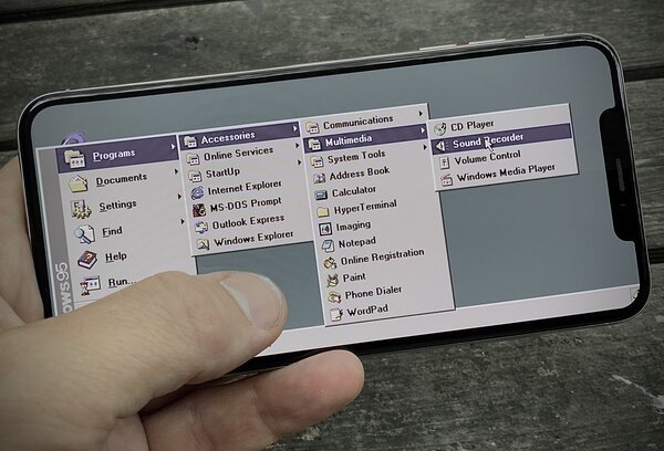
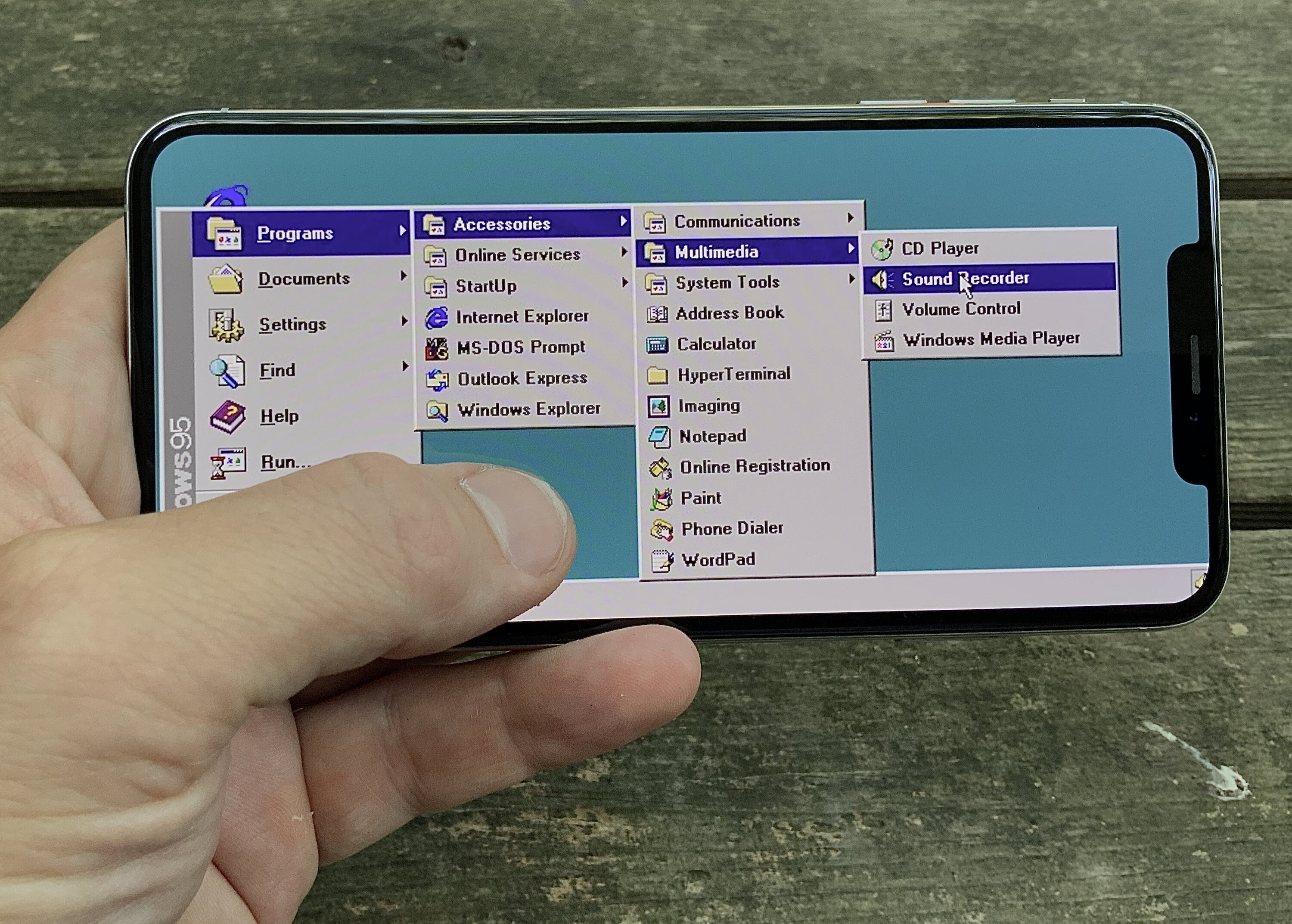
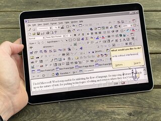
Traditional PC application interfaces have been primarily designed and developed with distinct input devices in mind, like the keyboard and mouse. Many conventions, best practices and design patterns have their link to this past. This is all fine when you are desiging an app for traditional PC's, but chances are that your target audience is using modern touch screen devices these days. It would be a mistake to recreate the old UI on modern touch screen devices!
Natural interactions
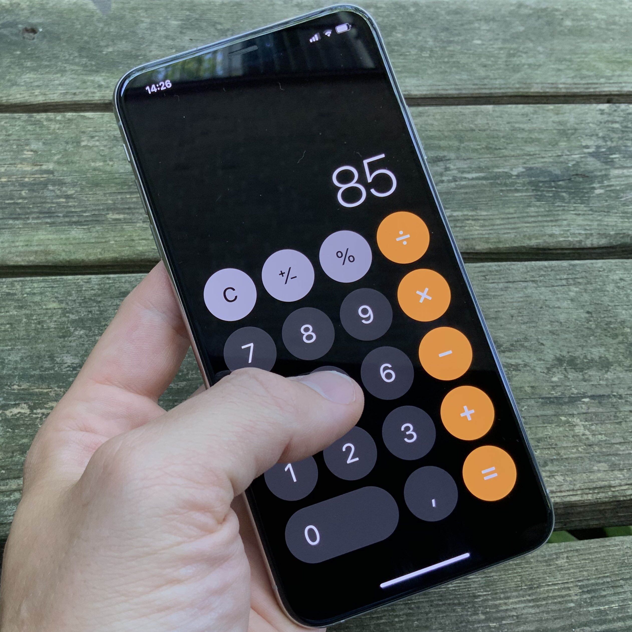
Modern touch screen devices enable interactions to become more natural as they eliminate the need for input devices such as the mouse. The device is the input button: on screen elements can be easily manipulated for direct and immediate interactions, using touch and gestures.
Declutter and size elements adequately
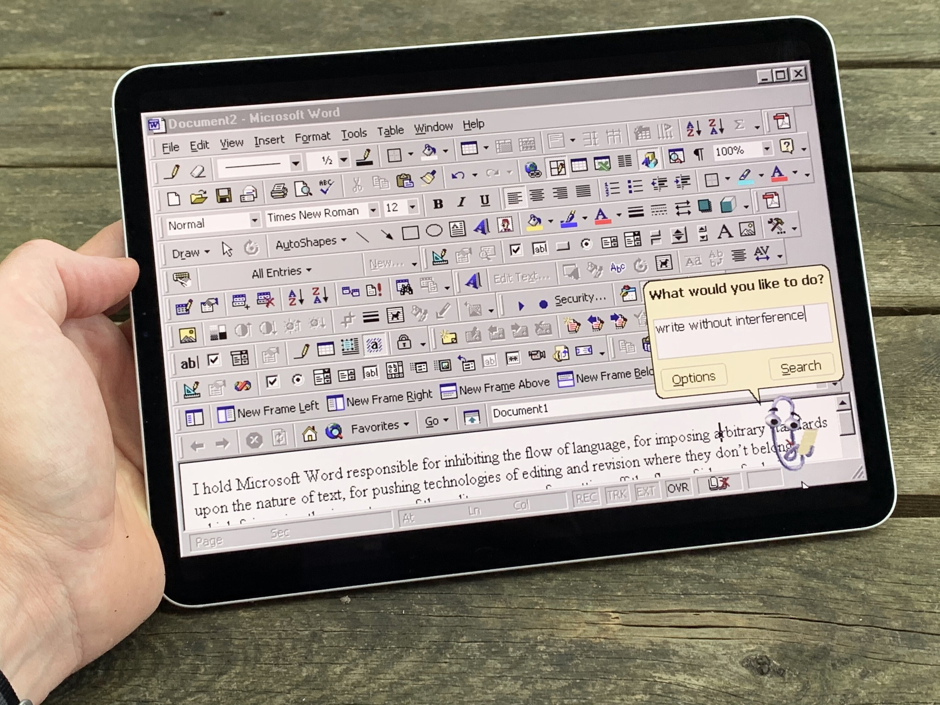
A finger is a lot larger than a pointy mouse cursor, this requires a different approach to sizing interface elements. Interactive elements should be big enough to be touched, with ample margins between them. Targets to close together increase the likelihood of error.
Optimise textual inputs
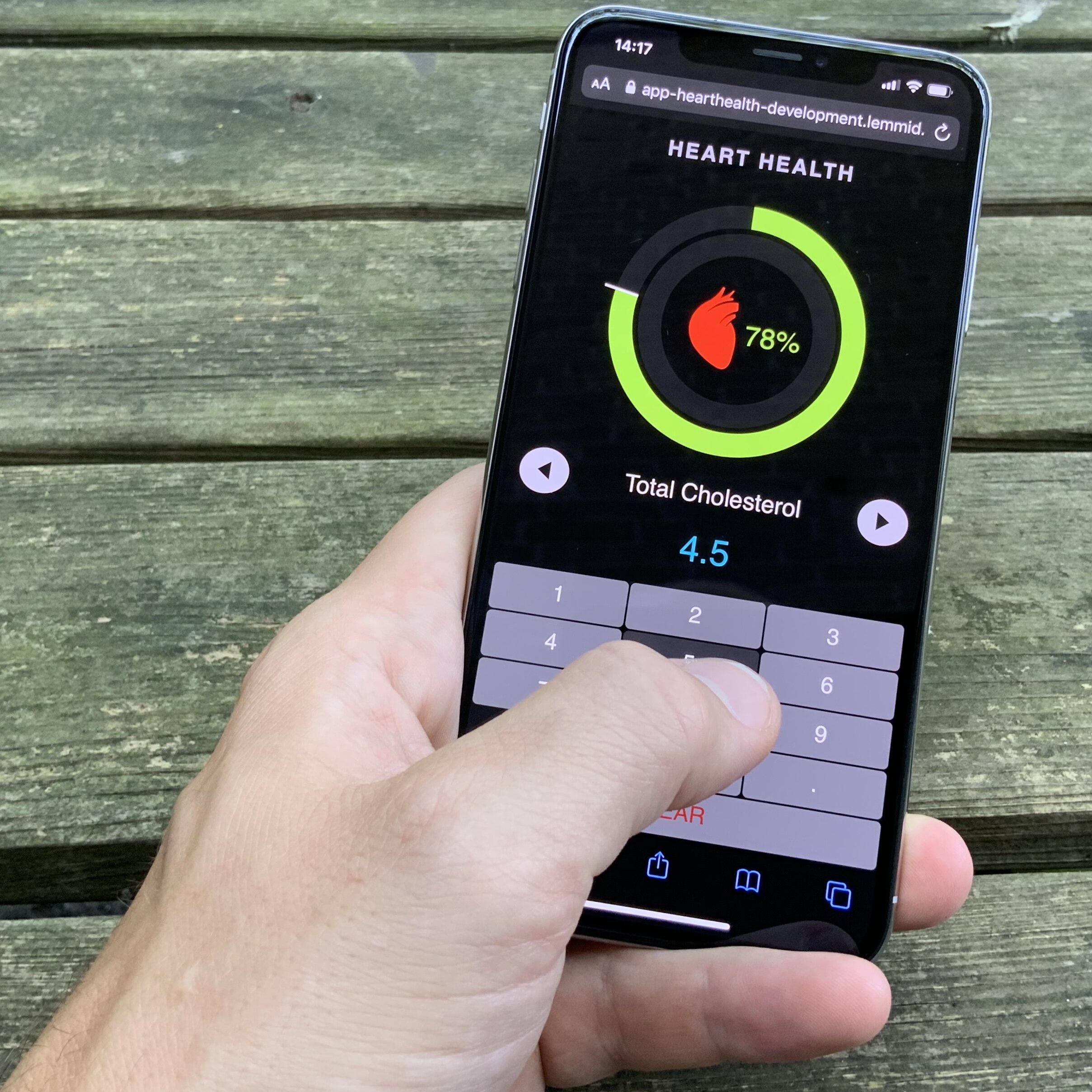
Depending on what you're building, chances are that you will need some kind of text or numeric input at some stage. The easy (and wrong) way to do this is to simply show a complete virtual keyboard. Instead of recreating a virtual recreation of the past (the physical keyboard) you should take the opportunity to rethink what you're asking the user. Depending on this input context you should then show a minimal keyboard that only offers those keys that are relevant.
Rethinking positions
Where traditional PC applications often have their toolbars on top of the windows, replicating this on a touch screen device would cause the hands to obstruct the remainder of the screen. In addition to keeping the contents of the screen visible, you should also consider the ergonomics of handling the device. Frequently used buttons should preferably be placed near the natural position of the fingers.
Forget hovering and tooltips
Forget interface elements, such as navigation structures, that rely on hovering. Most touch screens do not register fingers floating above the glass. Neither can you rely on tool tips to explain functionality of your interface. A touch screen UI should be clear to the user at first glance.
Be creative
Designing for touch interaction is something you should - above all - approach as something creative. Instead of recreating the old, you should be thinking of all the possibilities the new offers.
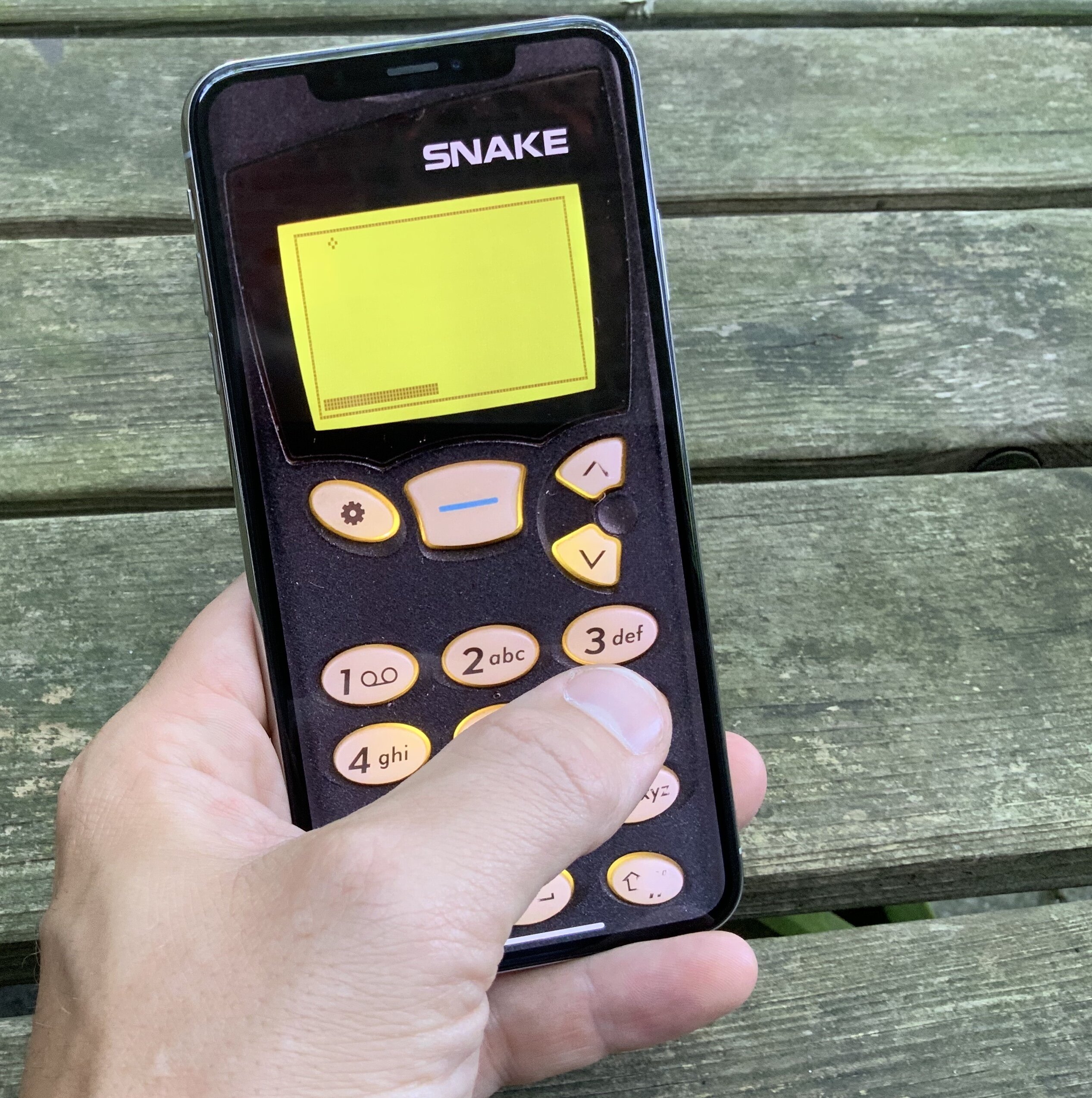
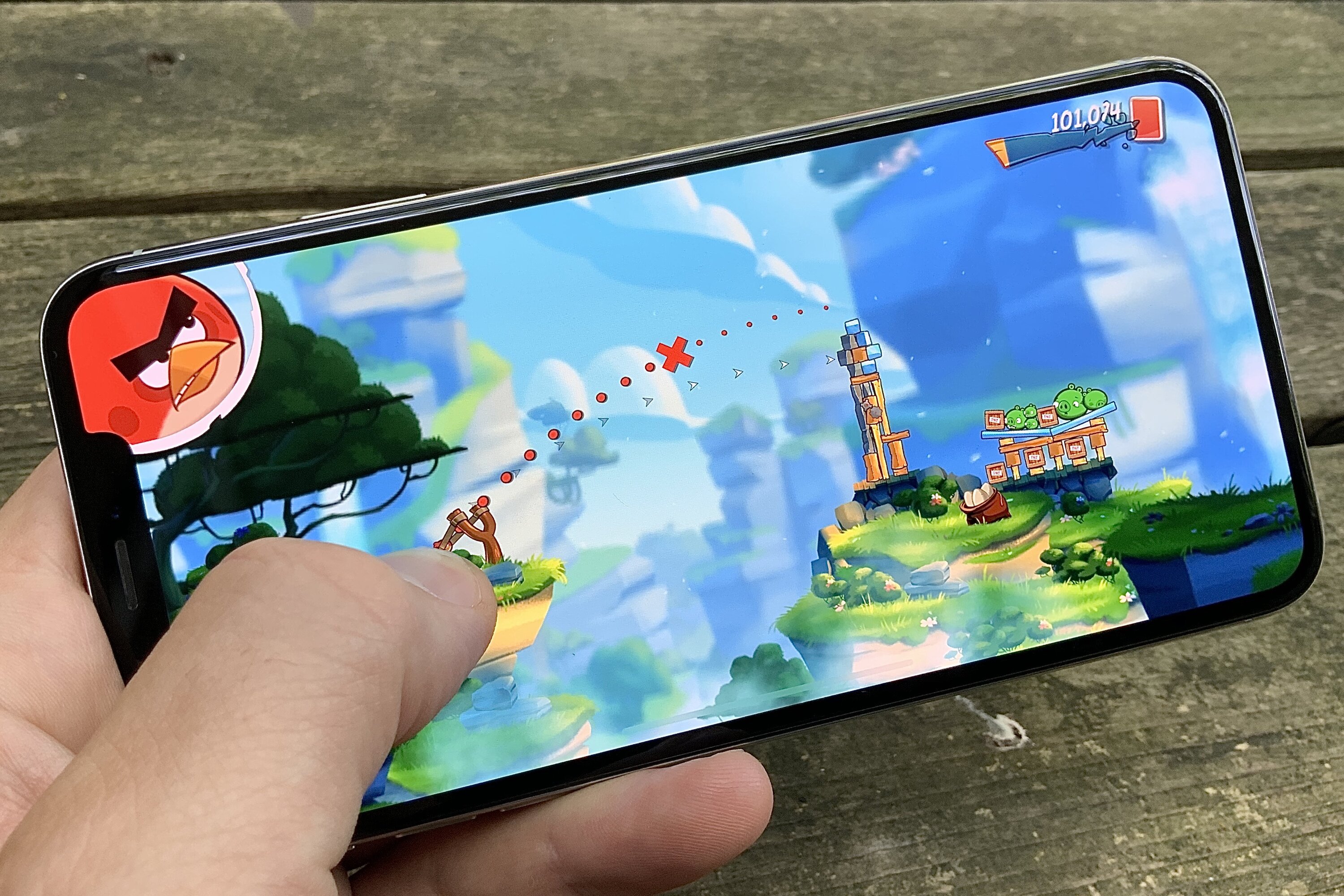
When I created the Snake 97 game for touch screen devices I recreated the old input mechanism with painstaking attention to detail. While I think this is fun, it is arguably bad UI design as it totally ignores all the possibilities offered by the new technology. It's no surprise then that games like Angry Birds are so successful as they take full advantage of the natural interaction made possible by touch.
Conclusion
One influential professor once asked me: "But is it fun, Willem?". When you are designing for touch, you should really consider this question. If you answer it with "YES!" then you should consider yourself on the right track.
You should be reimagining interaction instead of recreating old things. Sure, not everything old is bad; but it would be a mistake to ignore the potential good that modern technology enables!
Download
If you enjoy reading offline, this article is available for download:
Translations
This article is available in the following languages:
RSS / Atom
Grab one of the feeds to stay up to date, the feeds contain the full posts: