May 1, 2020
Designing an interface for a food ordering page
Striking a balance between powerful options and mobile usability
Online ordering pages are more important than ever before. The COVID-19 virus, the resulting lockdowns and the social distancing rules have emphasised the need for a well-designed webshop user interface. This is surprisingly hard to get right!
The challenge: online food orders
You might not realise it when you choose your pizza or french fries at your favourite takeaway restaurant, but ordering food is actually quite hard from an user interface design perspective. You must consider:
- product customisation: for instance offering different sauces, side dishes, toppings and sizes
- validating customisations: some customisations require an answer (like how would you like your steak, rare, medium or well done?), yet other customisations allow for more variance in their answer (like choose a "maximum of 5 pizza toppings")
- multiple variants: someone should be able to order two same pizza's, yet with different toppings
On top of this you must consider that about 80% of all this user interaction is done on a very small screen. This limits the amount of space available for buttons, toggles and switches. It's hard to get right and I was not surprised to see many existing apps and order pages fail to address this in an elegant manner.
Tackle complex challenges by sketching!
Whenever I face a complex design challenge I often start by sketching. I use an tablet as main computer that enables me to explore ideas by drawing them. Obviously you can use old fashioned paper, too. What's important is that you visualise your thinking, as it will unveil possibilities and limitations of your concept.
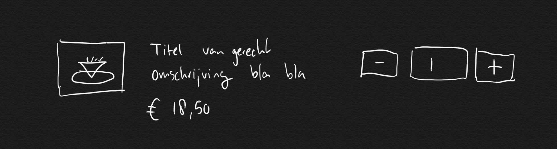
The sketch above shows my initial idea for the interface. You can see an image, a title, a product description, the price, plus and minus buttons and a box containing the number of products you've bought. It might seem like a good (and simple) start, but this design is flawed because:
- some products won't have an image, causing text to align weirdly if you have this interface in a list
- some products have long titles and descriptions, you must allow your the design to accommodate text wrapping
- this design totally ignores the product customisations (like choosing a topping or sauce)

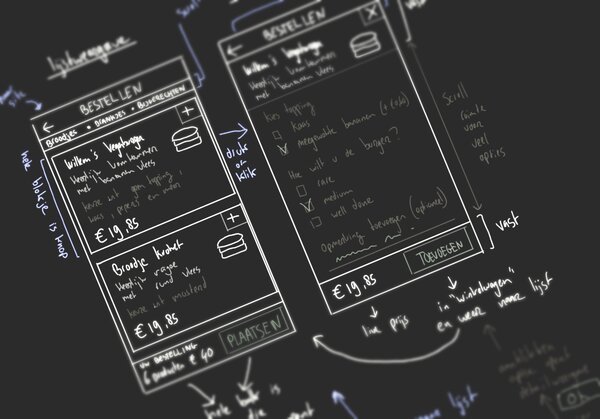
Sketch in the context of a smartphone and you'll quickly see where your design is wrong. In the second sketch (above) you'll see only two products listed on the ordering page, yet the number of visible buttons (plus / minus) is already double of that. Always exposing multiple buttons per product is clearly a bad idea, especially if you're dealing with a lot of products.
Real world thinking: two step interaction
In order to come up with something more elegant I tried imagining ordering dinner in a actual restaurant. I discovered that the waiter actually fulfils an important part of the puzzle: he or she responds to your choice by asking product specific questions. For instance, when I order steak, the waiter would ask me how I would like to have it cooked.
The trick is that only those questions are asked that are relevant to your selection. This helps when two persons (at the same table) order the same product, the personal approach allows for different customisations per person.
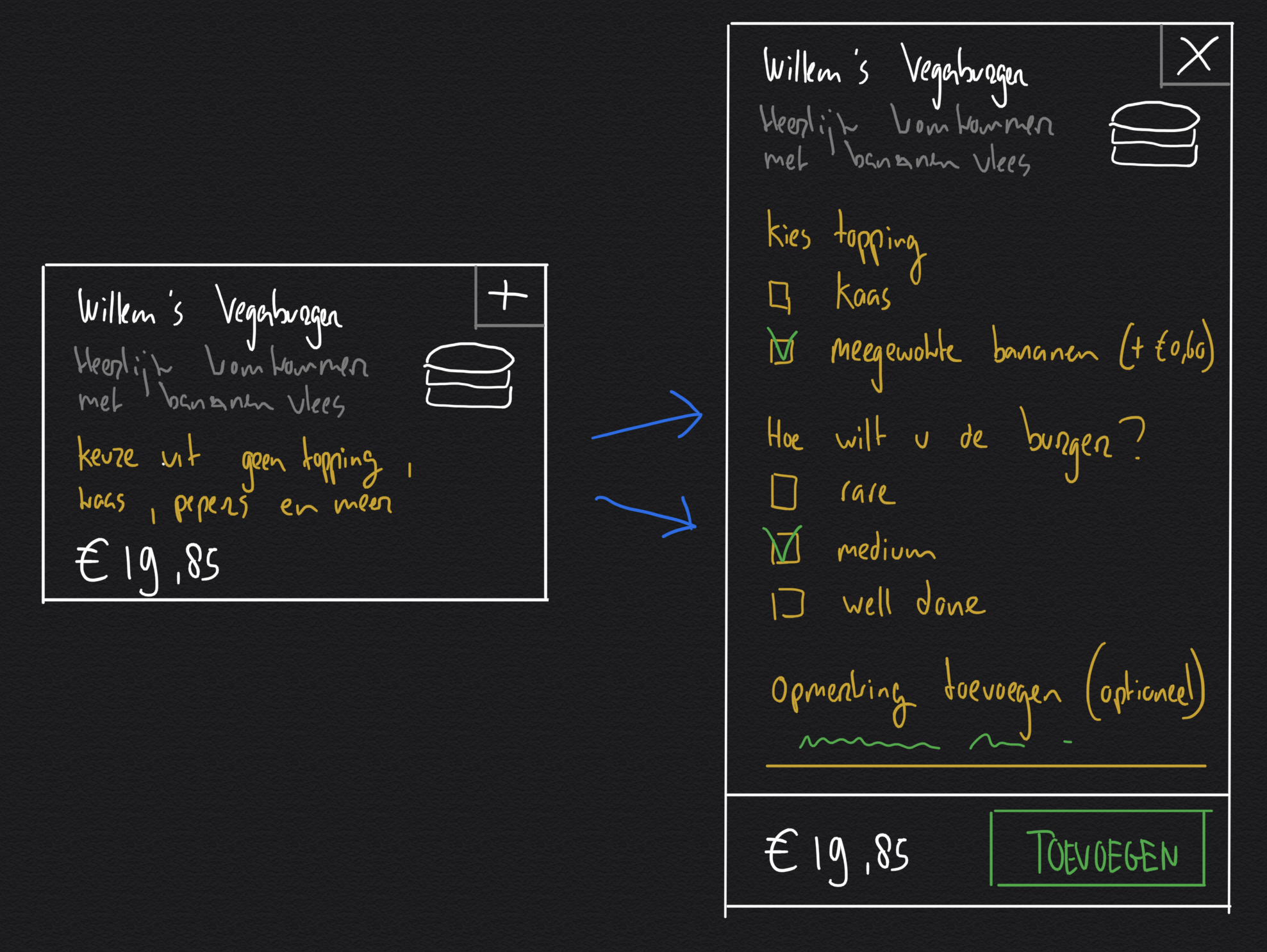
If you would try to capture this two step interaction in an user interface you could design a list/detail mode. Answering product specific questions is done in "detail mode", whereas the "list mode" offers a compact (yet informative) overview of the different products.
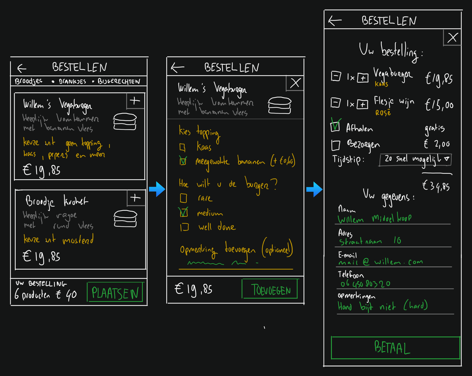
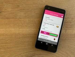
Completing the design: order food in 3 steps
Often the waiter in a restaurant completes the order taking by offering a summary of what has been ordered by all the different persons at a given table. This summarising is a very important (last) step before the order is send to the chef.
On the online ordering page this last step would work, too. It would function as a last check before you place the order. Following the real world analogy then leads to a simple 3 step food ordering user interface:
Conclusion
Designing a food ordering page is challenging because of the many different variables that you need to accommodate on a very small screen. Great design takes this complexity and makes it simple.
If you design an interface, it can be very useful to apply some real world thinking. Come up with a different analogy or metaphor. Seeing the ordering page as a "virtual restaurant waiter" helped me to come up with a simple three step design. I eventually implemented this design and it works fantastically!

Download
If you enjoy reading offline, this article is available for download:
Translations
This article is available in the following languages:
RSS / Atom
Grab one of the feeds to stay up to date, the feeds contain the full posts: