willem.com

Touch screen user interface design

Creating intuitive natural interfaces

June 24, 2020 -

Past weeks I have been working on a new app involving personal health. The main challenge is to come up with an intuitive, natural interface that works well on small touch screen devices. But what is it that makes an touch screen interface any good? Read along for some best practices.

Continue reading
The big 'yes/no' buttons reduce the likelihood of error as they do not require mouse pointer pixel precision
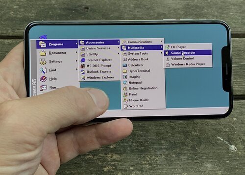
Navigation structures that rely on hovering are NOT going to work on touch screens
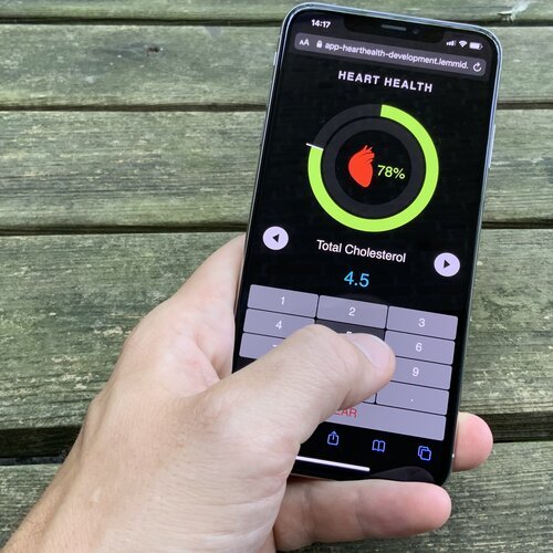
Directly manipulating the on screen elements feels natural - a mouse in this use case would be redundant
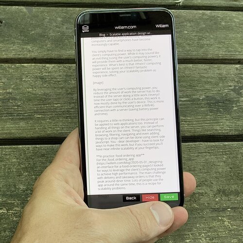
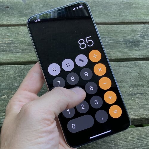
The Back / Hide / Save buttons are near the thumb: they are within range and reaching for them does not cover the contents of the screen
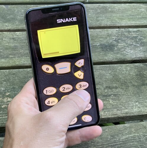
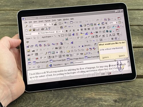
Recreating old UI patterns on a modern touch screen device is not going to win you any usability awards... (although, who doesn't miss Clippy?)
Catapulting birds is fun because of the natural interaction that is key to the Angry Birds game

Other stories

all blog posts

Tagged

CreatingCreativityDesignGameiOSiPad

Articles (153)